Client:
Academic
Year:
2019
Tools:
Figma, Illustrator
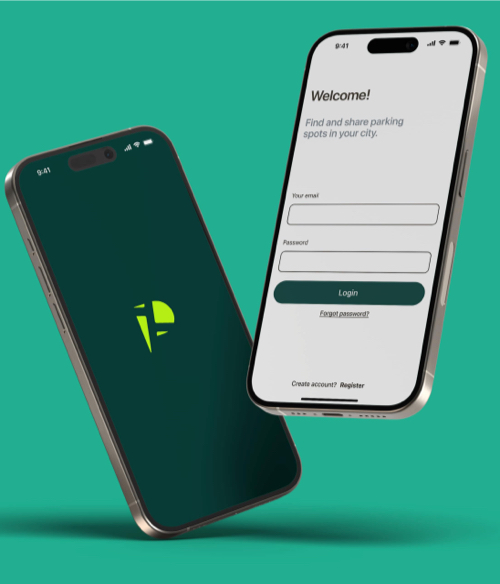
Park'n'Share is a dynamic mobile application designed to provide a solution to the urban parking experience in Boston. The app offers a solution that seamlessly combines real-time parking spot discovery, the ability to share upcoming vacant on-street spots, and a community-building platform for drivers.
What problem do drivers face?
Drivers in the busy downtown of Boston face significant challenges when it comes to finding available parking spots. This problem results in frustration, wasted time, and high levels of traffic congestion.
A versatile mobile app
An app that offers a two-fold solution by seamlessly integrating real-time parking spot discovery and promoting a sense of community among drivers.
Interactive map UI
By integrating an intuitive navigation and map user interface, drivers can securely and quickly locate available parking spots in their desired locations.
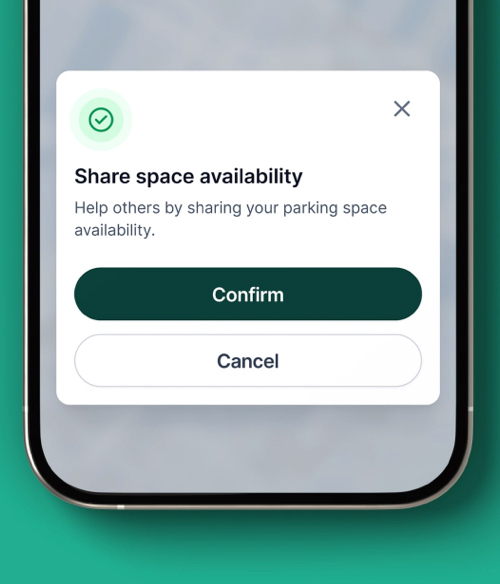
'Share spot' feature
The app's additional 'Share Spot' feature empowers users to mark their soon-to-be-vacant parking spots, enabling other drivers to anticipate and secure those spots efficiently.
Feature prioritization
After prioritizing user needs, the importance of having on-street parking solutions became more evident. We decided to focus on these three features.
Show parking spaces nearby
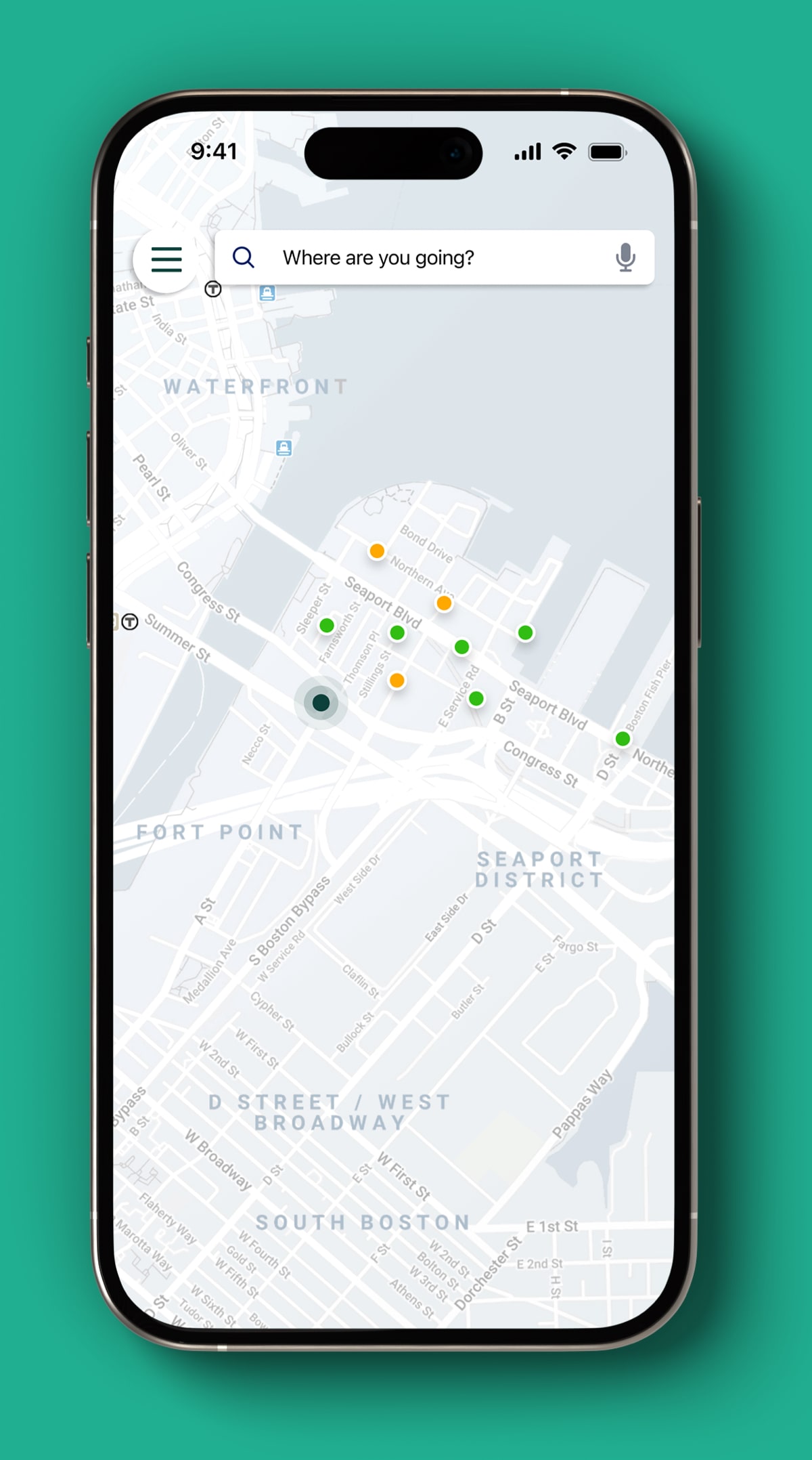
Once the user accesses the app, it will present a map showcasing all nearby available parking spaces. Green denotes spaces currently available, while orange indicates spaces expected to become available soon.
Track selected parking space
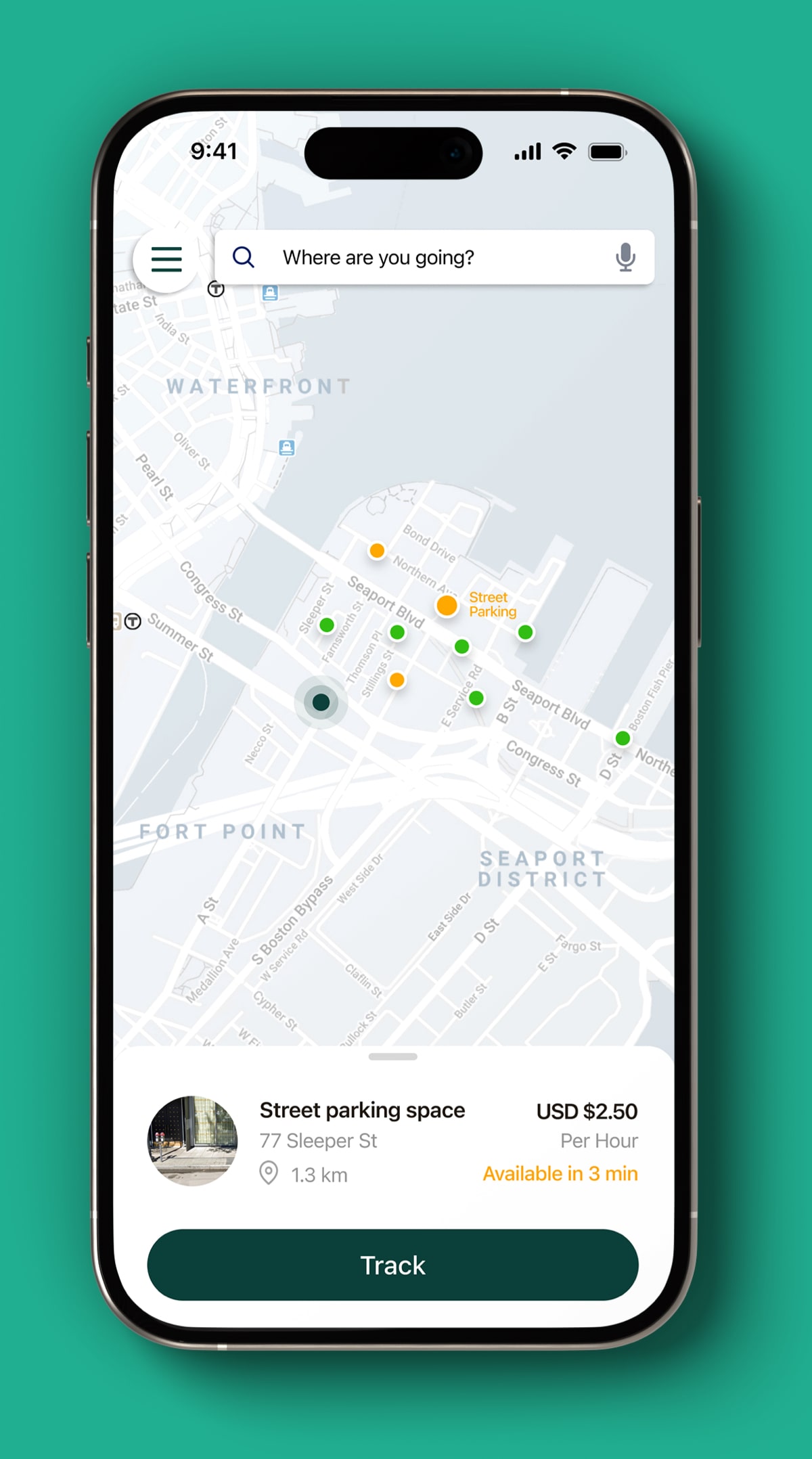
When a user taps on any available space, they'll have the option to "Track" its availability status.
Show route to selected space
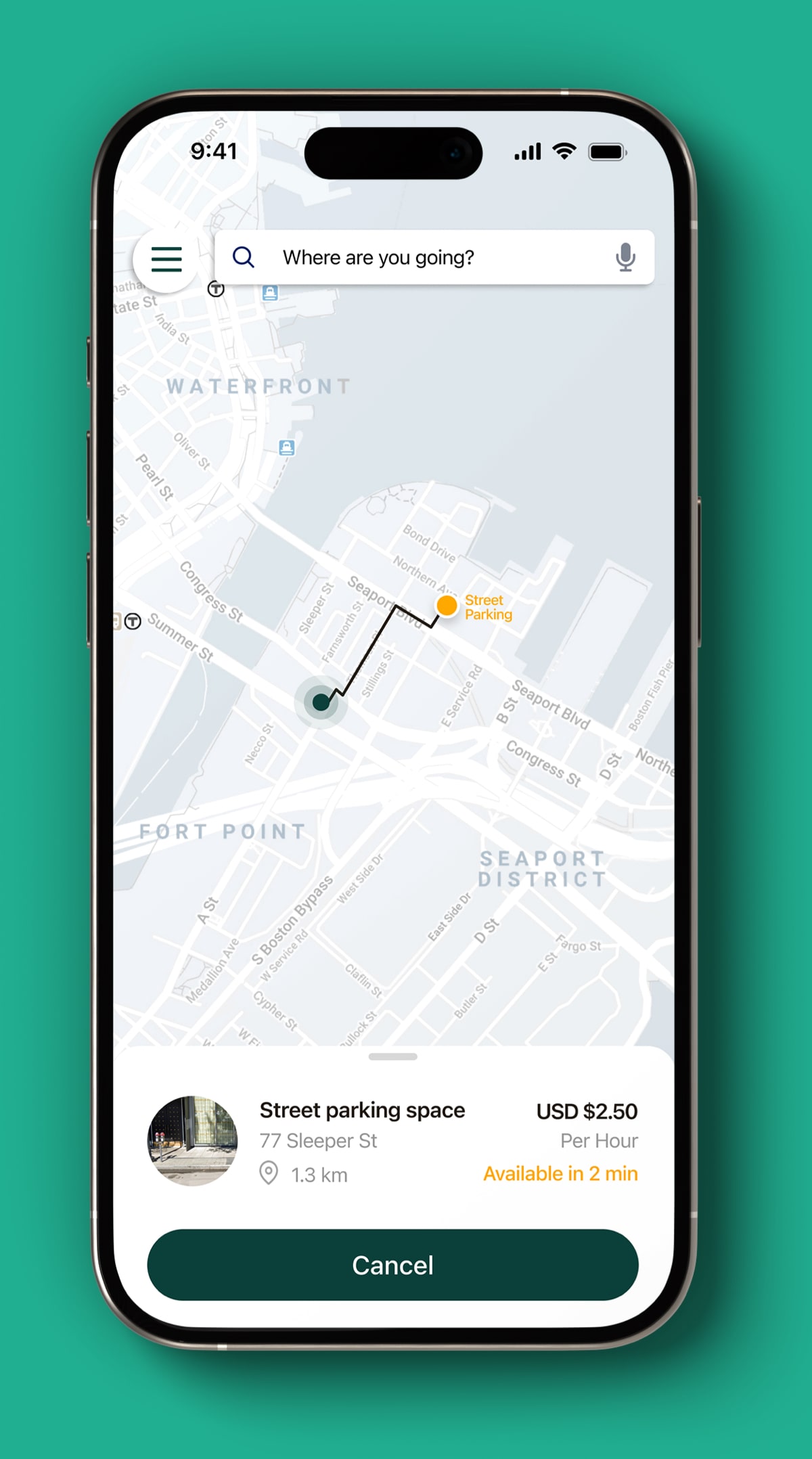
If a user chooses to track a parking space, the app will display the optimal route to reach the selected spot.
Visual Design
The user interface was improved to address design and interaction gaps identified in previous iterations. It was important to clearly highlight relevant information such as location, destination, routes, and parking spaces for drivers while utilizing the map.
Color Palette
Using a light-colored map, I established contrast with key elements and reduced the visibility of unnecessary information to help drivers focus on their journey.
Hex code
#11443E
RGB
17, 68, 62
CMYK
75, 0, 8, 73
Hex code
#4FC3AB
RGB
79, 195, 171
CMYK
59, 0, 12, 23
Hex code
#C2FF1C
RGB
94, 255, 28
CMYK
23, 0, 89, 0
Hex code
#63695B
RGB
99, 105, 91
CMYK
5, 0, 13, 58
Hex code
#261F17
RGB
38, 31, 23
CMYK
0, 18, 39, 85
Typography
The use of native app fonts (SF Pro and Roboto) ensured readability and consistency across various screen sizes, which I considered extremely important when designing and presenting the map information.


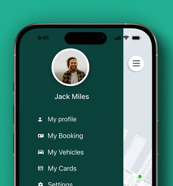
Final app design
A dynamic mobile app design that not only offers intuitive navigation but also allows users to share real-time availability of their parking spots, creating a sense of community and support.
What did I learn?
Through prioritizing user needs, I learned the importance of focusing on features that directly address the core problems faced by drivers. By understanding the challenges, I was able to design a mobile app that offers practical solutions and enhances the overall user experience.
What it can be improved?
While the app includes a "Share Spot" feature to promote community among drivers, there may be opportunities to further enhance community-building aspects. Exploring additional features or incentives to encourage users to actively participate in sharing parking spots and engaging with the community could further strengthen this feature.
