Client:
Kiwik Dollar LLC
Year:
2019
Tools:
HTML, CSS, Angular JS, Google Analytics

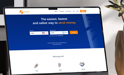


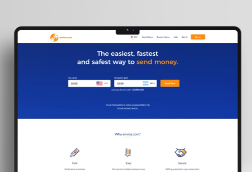


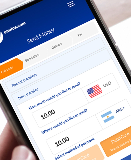
Envios.com is an online platform that simplifies and enhances the experience of sending money abroad from the United States. With competitive exchange rates, low fees, and multiple payment methods, users can complete secure money transfers to countries such as Mexico, Central and South America, and the Philippines.
Problem Statement
The current website did not meet the essential features outlined in the initial requirements, resulting in low usage and limited customer engagement. Users clearly demonstrated a preference for alternative money transfer methods due to these limitations.
Prioritize relevant features
Using insights from user research and usability testing, I defined the essential features for users and prioritized their enhancement and development.
Streamline current tasks
I defined a user flow structure that simplifies the current money transfer task, along with an improved user interface that guides users through the process.
SEO Implementation
Implemented Google Analytics to understand user behavior, track conversion goals (money transfers and account creation), and monitor website performance.
User interaction
The current money transfer task was confusing for most users. I proposed a intuitive linear process similar to a shopping cart where user are guided from start to end.

1. A linear process that clearly indicates where the process starts and where it finishes.
2. Each step indicates what information is required.


3. Only one step is showed at the time.
4. Granting users the freedom to navigate between completed steps.

Visual design
By adding a complementary color (blue), the website would appear more attractive and engaging to the users. The implementation of a clean layout and minimal icons allows users to clearly identify relevant information.
Color Palette
By using blue as the dominant color for most interface elements, my goal was to establish consistency across the website. Users will be able to associate these colors with the brand, enhancing recognition.
Hex code
#002266
RGB
0, 34, 102
CMYK
100, 67, 0, 60
Hex code
#E6F1FF
RGB
230, 241, 255
CMYK
10, 5, 0, 0
Hex code
#003CB3
RGB
0, 60, 179
CMYK
100, 66, 0, 30
Hex code
#FF8100
RGB
255, 129, 0
CMYK
0, 49, 100, 0
Hex code
#313335
RGB
49, 51, 53
CMYK
8, 4, 0, 79
Typography
Lato is a clean and modern typeface known for its exceptional readability. Its legibility and aesthetic appeal allow a consistent user experience.


Delivered website
A redesigned money transfer website where crucial tasks were optimized, the user interface effectively informed and guided users, and enhancements in website visibility and accessibility enabled the proper measurement of the company's key strategies.
What did I learn?
Through user research and usability testing, I learned the importance of prioritizing features based on user needs and preferences. This also enabled me to make better decisions when enhancing the money transfer tasks.
I recognized the significance of implementing SEO strategies, such as Google Analytics, to gain insights into user behavior, track conversions, and monitor website performance. This allowed me to make informed decisions and improvements once the website was launched.
What it can be improved?
Despite efforts to simplify the money transfer task, there's still room for improvement in user interaction. Conducting further usability testing and gathering feedback from users can help identify areas of confusion and refine the user experience.
