Client:
Academic
Year:
2024
Tools:
InDesign, Illustrator
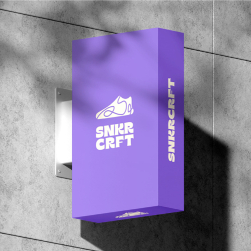
SNKRCRFT is a shoe retail store concept that redefines the sneaker shopping experience. Customers can shop from a wide variaty of sneakers, customize their sneakers and participate in design challenges to share their skills and creativity.
New store concept
Create an immersive retail experience combining fashion, shopping, culinary offerings, and other activities to reflect a lifestyle of exploration and community.
Logo design
Design a versatile logo that is instantly recognizable and captures the essence of the store.
Visual identity
Apply different design elements and create a brand personality that conveys the essence of the store. Also, a document that supports the application on different platforms.
A store with urban style
Using different moodboards, I came up with the idea that urban style would be an appropriate way to connect people with sneakers.
Logo development
I explored and sketched different logos, looking for concepts that clearly represents the uniqueness and creativity of the store.
Brand guidelines
I created well-documented brand guidelines that support the brand's identity and guide designers to implement the brand elements properly.
Final design
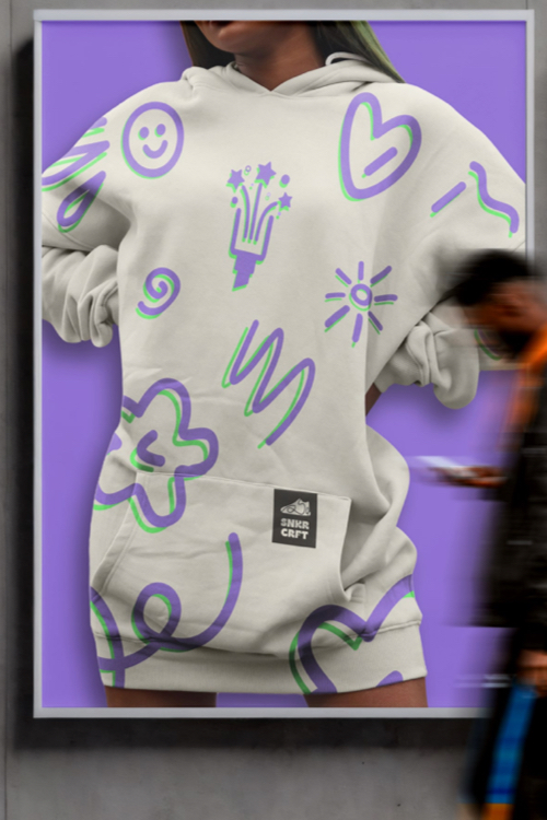
A brand identity that reflects the essence and unique style of the store by combining logos, icons, patterns, typography, and colors. This design allows the brand to speak for itself and connect with customers in a creative way.
Logo construction
The logo consists of two main elements: the sneaker shape, representing the brand’s main product, and a doodle stroke symbolizing the sneaker's customization offered by the store.
Color Palette
By combining these vibrant colors, I wanted to express the energy, creativity, feelings, and emotions that people show when they either wear or customize their sneakers.
Hex code
#8A69D4
RGB
138, 105, 212
CMYK
35, 50, 0, 17
Hex code
#4F4861
RGB
79, 72, 97
CMYK
19, 26, 0, 62
Hex code
#5BED62
RGB
91, 237, 98
CMYK
62, 0, 59, 7
Hex code
#2A2723
RGB
42, 39, 35
CMYK
90, 90, 90, 90
Hex code
#F8F1E0
RGB
248, 241, 224
CMYK
0, 3, 10, 3
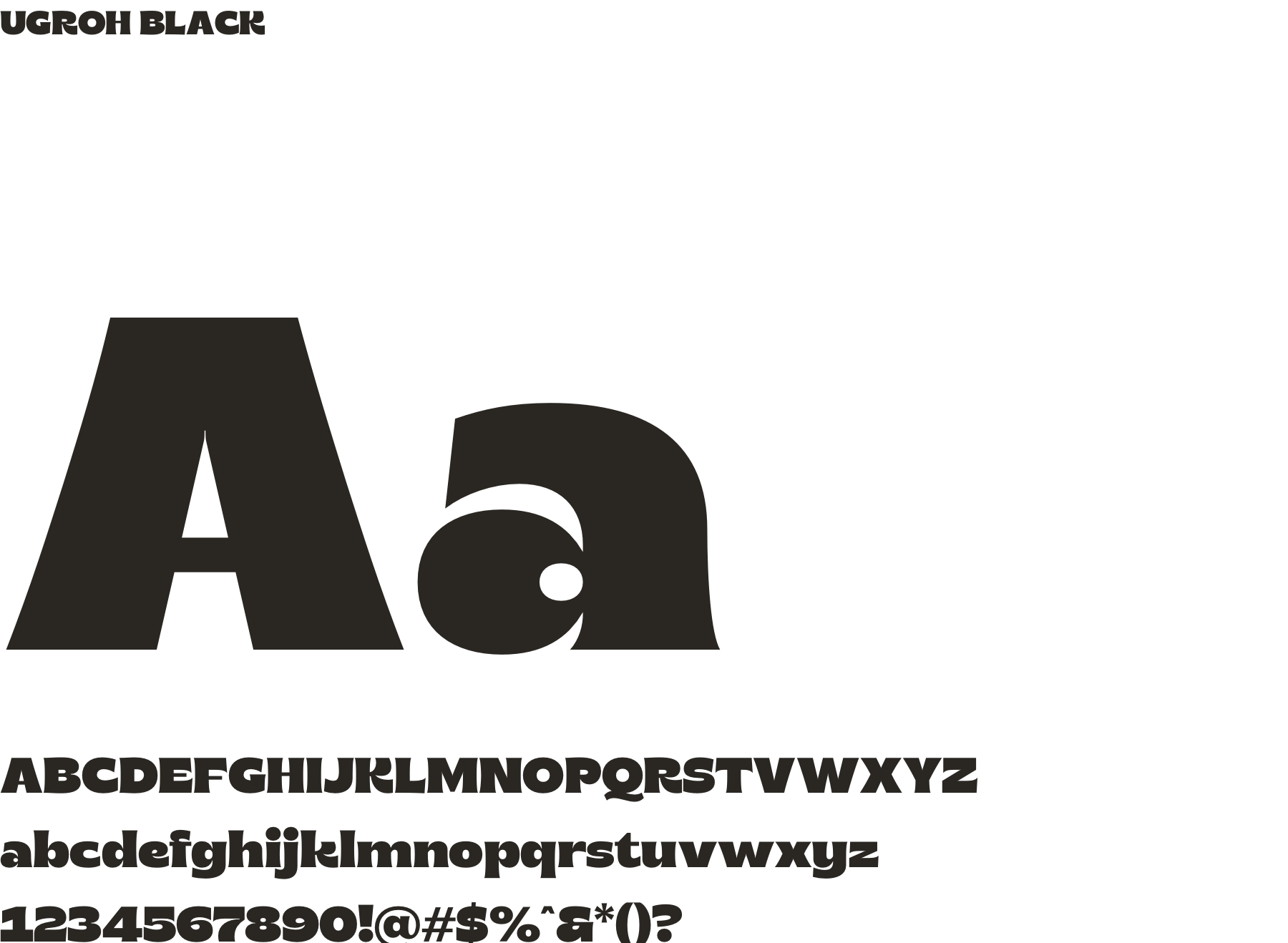
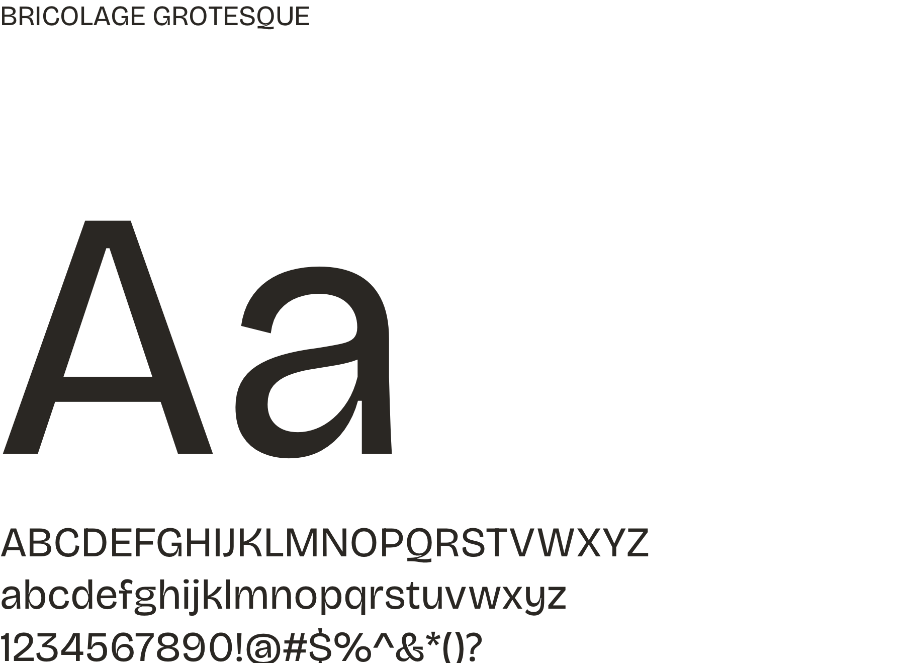
Typography
The selected fonts are intended to provide a sense of boldness and uniqueness, which I considered important for a sneaker brand. While Ugroh Black provides boldness, Bricolage Grotesque, with its exaggerated ink traps, offers readability and functional text for long reading content.
Brand guidelines
The delivered document clearly provides guidance and rules for using brand marketing materials and visual elements consistently across different channels.
What did I learn?
The significance of aligning the brand concept with the target audience and product/service offered, illustrated through connecting urban street style with sneaker culture for the brand's identity. The process of logo development, focusing on exploring various elements to encapsulate the brand's essence. Lastly, the importance of creating comprehensive brand guidelines to maintain consistency across diverse brand channels.
What it can be improved?
While the project emphasizes the urban street style concept, I think providing detailed insights into the selection of design elements such as patterns, icons, and imagery could strengthen the brand's personality and differentiation in the market.
